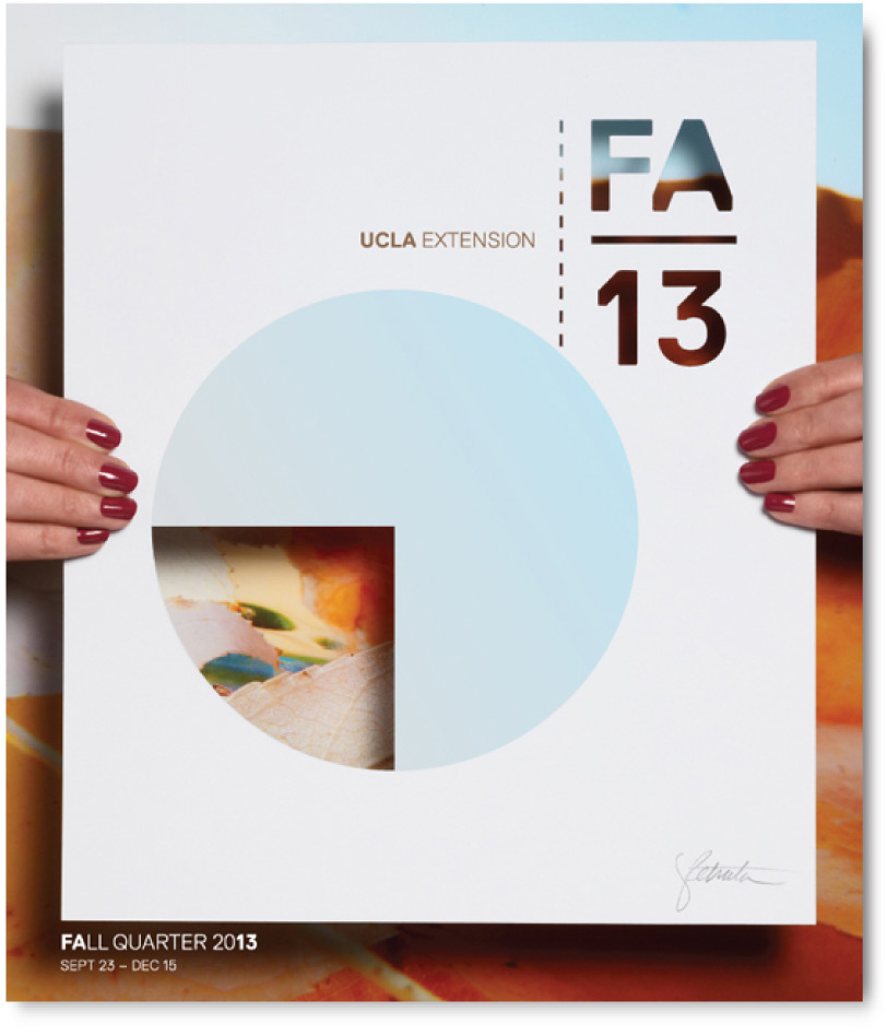
The cover imagery was an invitation for students to learn and explore. Conceptually, the fall quarter is a portal, or a window to the creativity and complexity behind it. The colors and shapes mimic the transition from summer to fall.

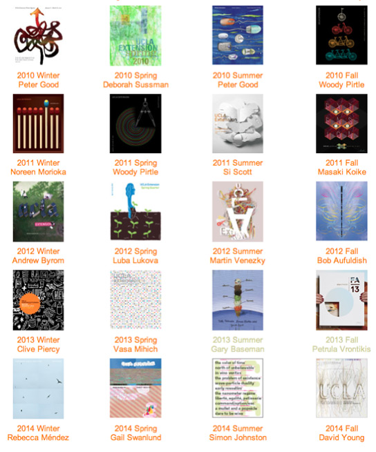
UCLA Extension selects leading designers to create covers for their printed catalog—which is sent to hundreds of thousands of people in the Los Angeles area and around the world. Pictured here are covers from 2010-2014.
The Master Graphic Designer Series dates back to 1990 showcasing top-level creative talent.

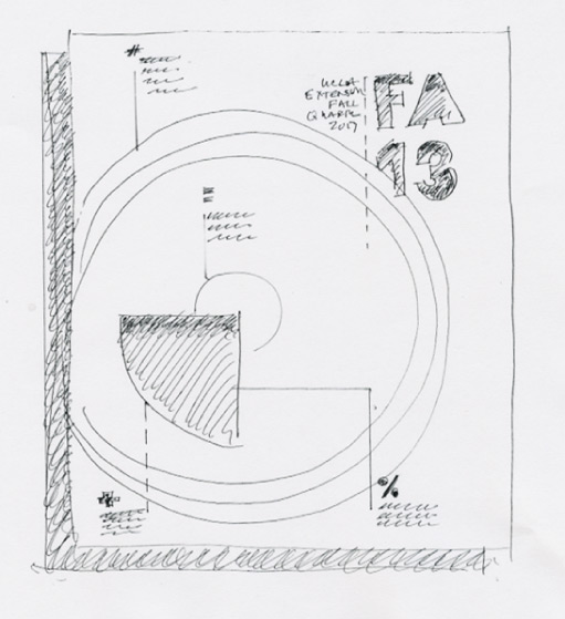
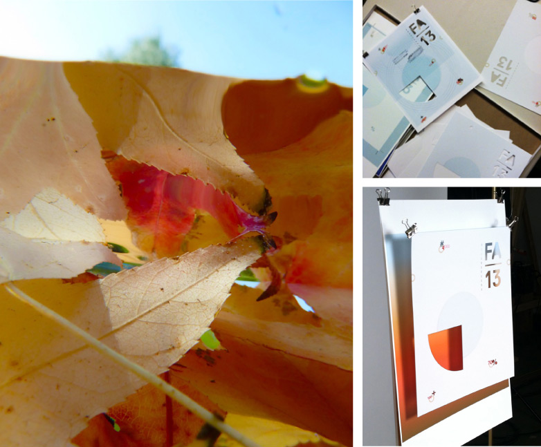
An early sketch shows the layered effect that was later achieved by creating an actual size dimensional set-up. Various die cuts, graphic elements, and backgrounds were tested. In the final photography, scale was established by Petrula standing behind the set up with her hands holding either side of the cover mock up.
The final background image was one of Petrula’s half-in, half-out of water photography experiments. More of her underwater imagery can be seen here.
